
Wait statistics are visible on the Monitoring > Wait statistics page. SQL Governor automatically collects instance waits from every instance being monitored, while query waits have to be enabled separately. Query waits collection takes up some resources and disk space but allows drilling down into the details of the queries that caused the waits.
When you open the page, you will see the default overview that should look something like this:
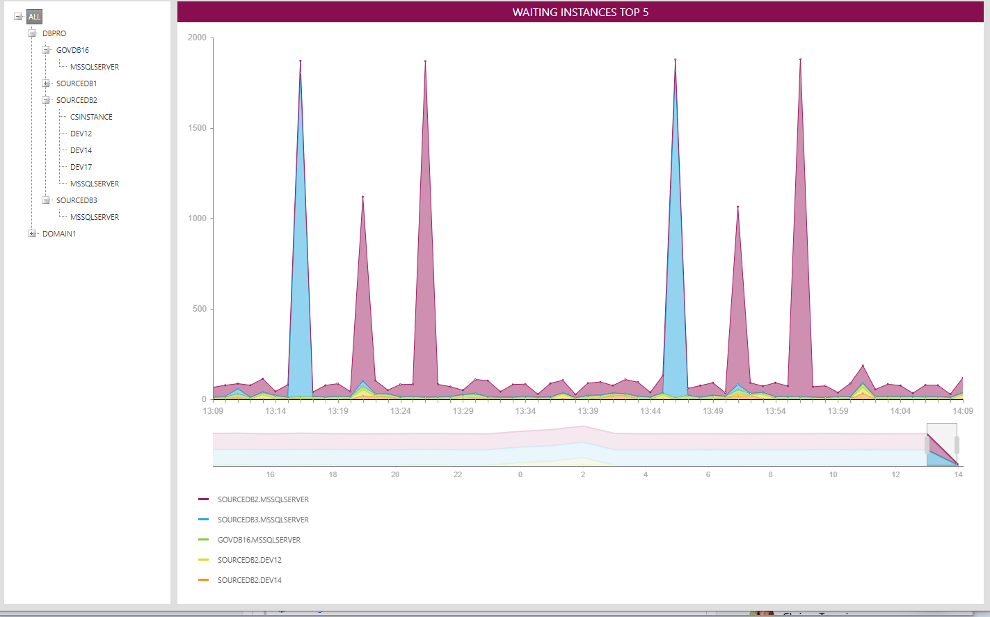
Here, the top 5 waiting instances in your environment and their total instance waits are shown. You can change the view by right-clicking on the chart and selecting a different view from the menu:

The above view shows instance waits by group over the whole environment, since the ALL node is still selected. There are five groups: CPU, memory, IO, locks and miscellaneous. We can see that most of the waits in our environment are in the locks group. By clicking on one of the data points you can drill down to the top 5 waits in the group you clicked:

The above view shows the top 5 environment-wide lock waits. We can see that almost all of the lock waits are of the type LCK_M_IS. By clicking on one of the other lock types in the list we can see a chart with only that lock type. For example clicking on LCK_M_X (the blue item) gives us this view:

Clicking on the blue item again brings us back to the previous view.
When you click on a server or instance node in the tree, you will see the waits on that server or instance. At the instance level, drill down into the query level is also possible, if you have enabled query waits collection:

The above screenshot shows that query waits has been enabled on the selected instance. You can see the status of each instance by selecting the instance and right-clicking on it. Like instance waits, query waits can be viewed on a top 5 or per group basis. Here, the top 5 query waits on the selected instance are shown:

We can see that CXPACKET is the type that has caused the most query waits in general, but at 12:04, 12:35 and 12:40 there are spikes in SOS_SCHEDULER_YIELD. By clicking on one of the data points, we can see the top wait-causing queries at that particular time in a column chart:

Here, each column represents a SQL batch, identified by an internal batch ID shown under the column. The wait type you clicked in the previous chart is highlighted in orange; other wait types in the same batch are shown in a grey color.
When you hover the mouse over a column (or a part of a column), you will see a tooltip showing more details about the batch and the wait type in question. Clicking on a column will take you to the SQL text of the batch in question:

The full batch text is split into statements, with statements that caused waits shown in a blue color and non-waiting statements shown in grey. Clicking on a waiting (blue) statement will display a tooltip with the wait types and wait times:

Again, the wait type that was selected earlier is shown in orange.
To get back to the column chart view, right-click anywhere in the batch text and select "Back". To get back to the query waits timeline chart from the column chart, click on any node in the tree.